WavTooCrazy — Channel Cover
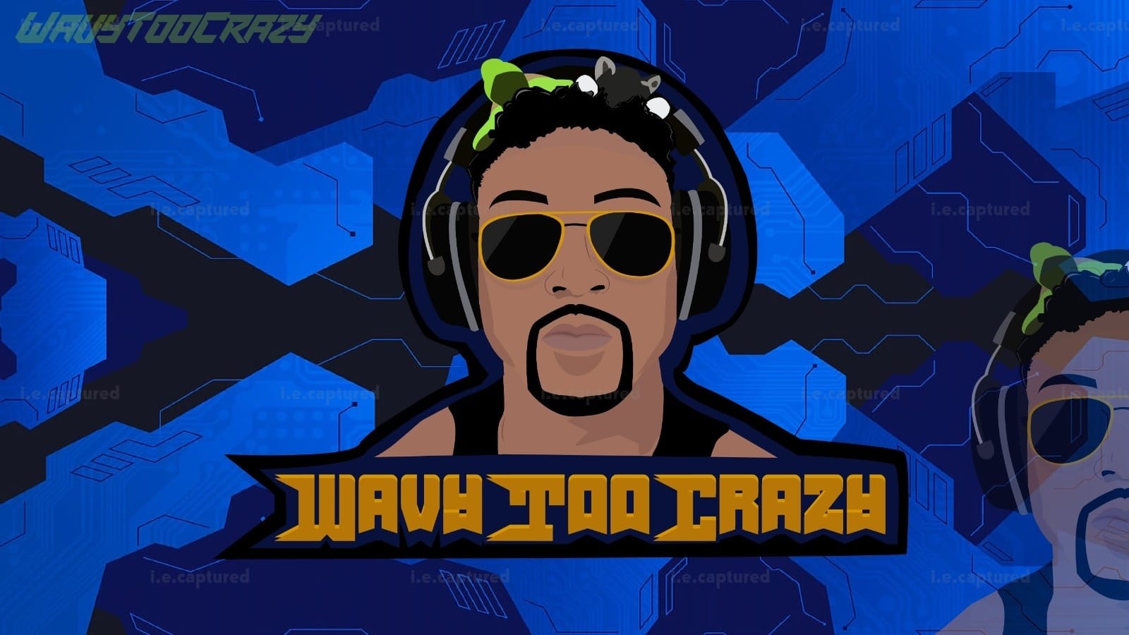
This cover was made specifically to set the tone of the channel the second someone lands on it. The goal wasn’t to just place the name on a background but it had to feel immersive and strong across the full width of a banner.
When we started, the first draft was actually much simpler. Cleaner background, less depth. But it felt flat. It didnt carry enough presence for a channel header. So we pushed it further and added layered blue tech elements, built more dimension into the background, and gave it that digital atmosphere without making it chaotic.
He was very clear about wanting it to feel confident but not over the top aggressive. So I kept the expression calm and composed. The sunglasses added that controlled, almost unbothered vibe, something that feels established rather than trying too hard.
Typography took a few adjustments too. At one point it felt too tight for the space so I widened the layout and gave the name breathing room. On a cover, spacing is everything. If it’s cramped, it kills the whole design. The gold lettering was kept bold so it cuts through the heavy blue background instantly.
After refining the balance between the character, the name and the background depth, everything finally clicked. It felt solid. It filled the space properly. It looked like it belonged there.
In the end, this wasn’t just a banner and it became a strong visual header that frames the entire channel.
Let’s Make It Yours
Thanks for stopping by and checking out my work. If you’d like a custom piece, head over to the Commissions page — I’d love to hear what you have in mind.