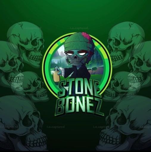
Stone Bonez
This logo was built around mood before anything else. The name itself already carries weight so I didn’t want the design to feel clean or polished in a traditional sense. It needed edge. Texture. A bit of defiance.
The central skull character isn’t just there for shock value but it represents the alter ego behind the name. Calm, slightly detached, almost unimpressed. The beanie and casual pose soften the aggression just enough to keep it stylish instead of chaotic. That balance was important.
Green was chosen deliberately. Not the usual red or purple you’d expect from darker themes. The neon tinted green gives it a toxic, almost radioactive tone while still feeling modern and digital. It stands out hard on screens and thumbnails, which matters in gaming spaces where everything competes for attention.
The circular badge framing keeps the composition controlled, while the repeated skull silhouettes in the background create depth without cluttering the main mark. Typography was shaped to feel heavy and grounded, almost carved so the name doesn’t float. It sits.
This wasn’t about making something “cool” but it was about building a visual identity that feels like a character you’d recognize instantly, even without the full name attached.
Let’s Make It Yours
Thanks for stopping by and checking out my work. If you’d like a custom piece, head over to the Commissions page — I’d love to hear what you have in mind.