SHEENG12
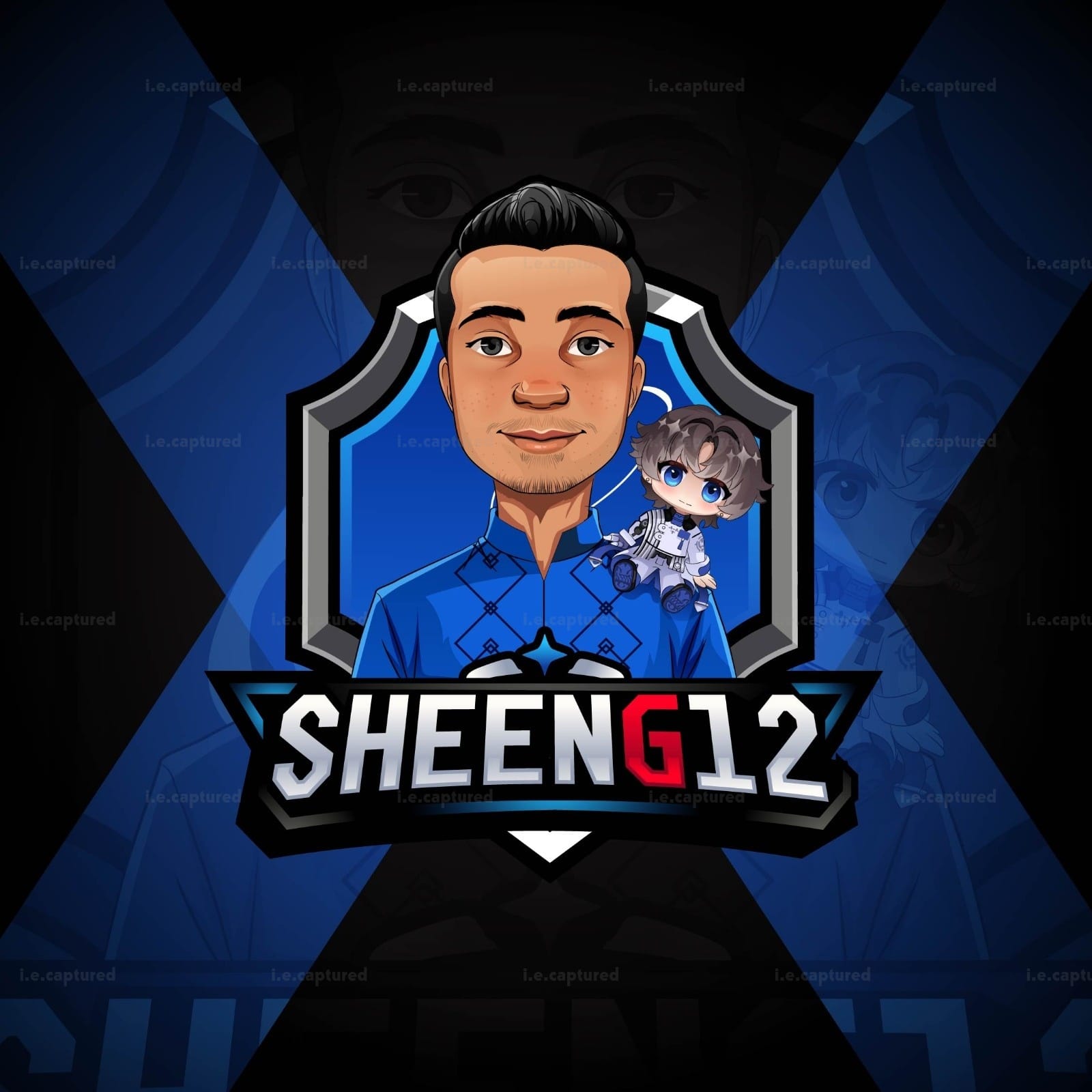
This logo was built around personality first and not just initials or typography but presence. SHEENG12 isn’t meant to feel like a flat gamer tag. It’s meant to feel like a recognizable identity.
Instead of keeping it minimal, I leaned into character illustration to make the brand instantly memorable. The central portrait keeps things grounded and confident, while the smaller chibi element adds a layer of approachability and personality. That contrast was intentionally serious but not stiff, competitive but still relatable.
The shield framing gives structure and strength, reinforcing the idea of a gaming persona that feels established rather than casual. Blue was kept dominant to reflect focus and control, while the red “G” breaks the flow just enough to create a visual hook. It pulls the eye in and prevents the name from blending into a single block of text.
Typography was designed to feel bold and competitive without becoming overly aggressive. Strong edges, controlled depth and a slight dimensional treatment keep it dynamic for digital use, whether its on streams, profile banners or esports style layouts.
Overall, this piece wasn’t about just designing a logo. It was about shaping an online identity that feels personal, distinctive and built to stand out in a crowded space.
Let’s Make It Yours
Thanks for stopping by and checking out my work. If you’d like a custom piece, head over to the Commissions page — I’d love to hear what you have in mind.