Insamniak
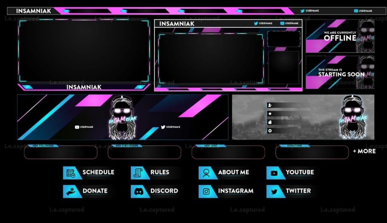
This overlay set was created for Insamniak with a clear direction from the start about modern, sharp, and instantly recognizable without being overloaded.
The pink and cyan accents were already part of the identity, so instead of pushing heavy neon effects, I focused on structure. The angled strips and clean spacing give the layout movement without making it chaotic. Everything feels aligned and intentional rather than decorative.
One of the main things I paid attention to was balance. Stream overlays can easily overpower the gameplay if the frames are too thick or too bright. Here, the borders stay controlled. They are strong enough to stand out, but they don’t eat into the content. That was important.
The Starting Soon and Offline screens follow the same visual language and same direction, same tone, same energy. I didn’t want separate designs stitched together. It needed to feel like one complete system that belongs to the same brand.
The lower panels for Schedule, Rules, Socials and Donations were kept simple and readable. No gimmicks. Just clean labels and clear icons so everything feels organized and easy to update.
Overall, this pack came out structured and polished without trying too hard. It carries personality but it stays professional.
Let’s Make It Yours
Thanks for stopping by and checking out my work. If you’d like a custom piece, head over to the Commissions page — I’d love to hear what you have in mind.