UPTEKKNO
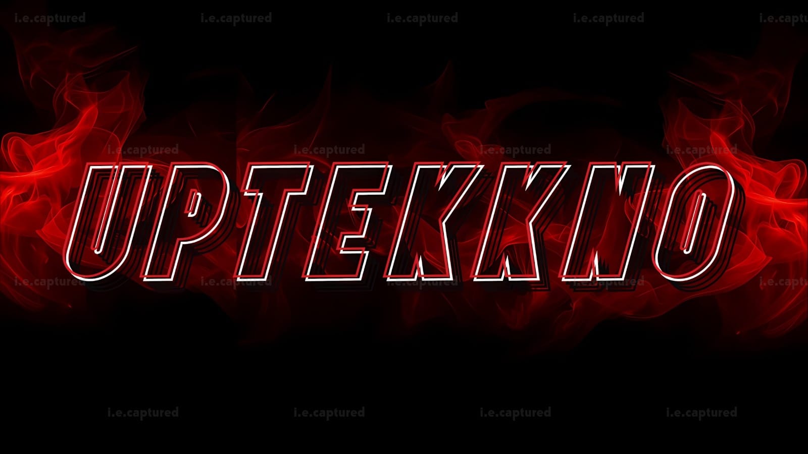
UPTEKKNO was built around one core idea, and that was “Intensity”.
From the first conversation, it was clear this wasn’t meant to be subtle or minimal. The name itself carries energy, speed, and that hard electronic punch, so the logo had to reflect that same aggression visually. The goal was to create something bold, sharp, and instantly recognizable, something that feels like it belongs to techno, hardstyle, and darker electronic spaces.
We leaned heavily into red as the dominant tone, not just for aesthetics but for emotion. Red brings heat, power and movement. Instead of using flat color, I introduced layered shadows and stacked outlines to give the typography depth and vibration. The slight offset layering behind the letters creates a sense of motion, almost like the word is echoing or pulsing, which ties directly into electronic sound energy.
The flame elements were added to build atmosphere without overpowering the typography. They sit behind the wordmark, adding dimension and drama while keeping the focus on the name itself. Everything was balanced intentionally as aggressive but still clean and readable.
Working on this logo was about translating sound into visual form. It wasn’t just about making something look “cool” but it was about making the identity feel aligned with the genre and the artist’s direction. The final result is a strong, high impact logo that carries presence even on its own.
Let’s Make It Yours
Thanks for stopping by and checking out my work. If you’d like a custom piece, head over to the Commissions page, I’d love to hear what you have in mind.